Building a brand that matches its founder's depth of expertise.
When Build Fitness Austin came to us, the brand gap was clear. They had a deeply credentialed, empathetic founder with a distinctive point of view, operating in a market full of loud, generic fitness brands, and completely invisible to the clients she was built to serve. We closed that gap with strategy first: defining her positioning, mapping her audience, and building a visual identity and website that puts her expertise front and center.
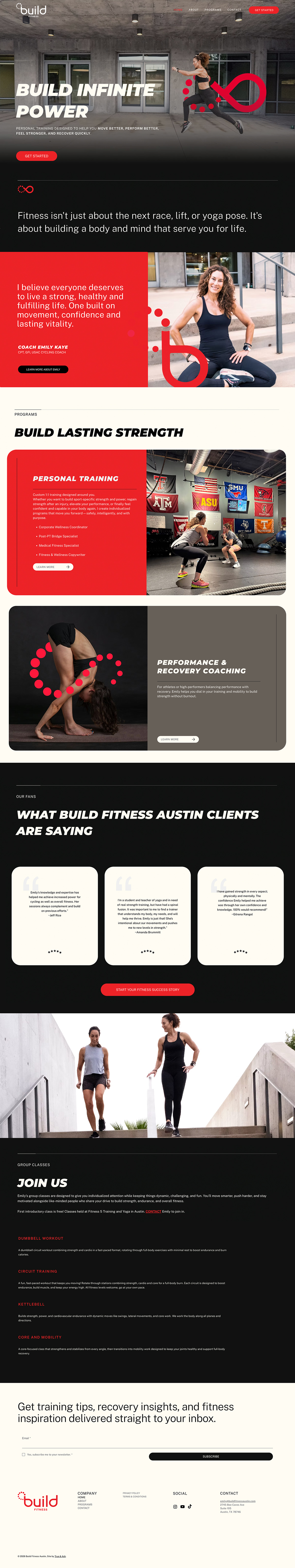
WHAT WE BUILT
With a sound strategic foundation, we built a vibrant and powerful brand with a feminine lean, a deliberate departure from the drab, earthy neutrals saturating the category. Bold sans-serif typography paired with handwritten accents gives the brand both authority and personal warmth, while the infinity symbol woven into the logo became a quiet nod to the brand's core promise: strength built for life, without a finish line.
THE RESULT
The website was built around conversion without pressure with every page written to build enough trust that reaching out felt like the natural next step. Service descriptions are given real depth, Emily's athletic credentials are prominent, and client testimonials anchor the social proof. Running through all of it is a brand voice that is warm, encouraging, bold, and never preachy.
Austin is one of the most fitness-obsessed cities in the country, yet in a market saturated with performance gyms and boutique studios chasing the client, no one was speaking directly to the experienced athlete who trains for longevity.”


.svg)